
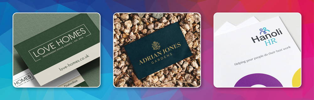
It often starts with a logo.
“We think ours looks a bit dated.”
“It doesn’t really reflect us anymore.”
“We’ve grown a lot since it was designed.”
All perfectly valid reasons to start looking at logo design services. But quite often, once we sit down with a business and start talking about what is no longer working, the logo turns out to be only one part of the problem.
The website may have developed separately. Printed materials may use slightly different colours. Signage might have been produced a few years ago. Social media graphics may have been created along the way by different people, and workwear may still be carrying an older version of the logo.
Nothing is necessarily terrible. It just does not quite feel joined up.
That is usually when the conversation moves from “we need a new logo” to “actually, we need our branding to work properly.”
This is something we see a lot with established small and medium-sized businesses. The company may have started with a simple logo when budgets were tighter and the main priority was getting up and running. At that stage, the branding only needed to do a fairly basic job.
Then the business grows.
There are more employees, better clients, larger contracts and perhaps new services or premises. The company becomes more established, more confident and more capable, but the branding often stays exactly where it was.
That can create a real gap between the quality of the business and the way it presents itself. A company may have years of experience, a loyal customer base and a strong reputation, but if the website, brochure or signage still looks dated, the first impression may not reflect the business as it is today.
And first impressions matter. Potential customers do not see the years of hard work behind the scenes before they see your website, proposal, brochure, signage or exhibition stand. If those things feel inconsistent or behind the times, the branding can quietly undermine the quality of what you actually do.
Good creative branding helps close that gap.
A strong logo gives a business something recognisable to build around. It should feel relevant to the company, work across different formats and give customers a clear visual connection to the brand.
But a logo on its own can only do so much.
Your wider visual identity is what creates consistency across the business. That can include your colour palette, typography, supporting graphic elements, imagery, layout styles and the way those elements are applied across your marketing materials.
In practical terms, that could include your website, business stationery, brochures, sales literature, social media graphics, signage, vehicle graphics, workwear, exhibition materials and promotional merchandise.
Customers probably are not consciously checking whether every font, shade and layout matches. But they do experience the overall effect.
When everything feels connected, the business looks more professional and earns more trust. It feels like there is a clear identity behind it. When every piece looks as though it has been created separately, the brand can feel less confident and less memorable.
That consistency is where branding starts to work harder.
Sometimes a new logo genuinely is enough. You may be launching a new business, creating a new division or refreshing an identity that otherwise works well.
In other cases, replacing the logo alone would only solve part of the problem. If the website, print, signage and other marketing materials have all developed separately, a new logo can simply become one more new element added into the mix.
This is why the first conversation matters so much.
Before any design work starts, it is useful to look at the business as a whole. What has changed? Who are you trying to attract now? Does the current branding still feel appropriate? Where does the identity need to work? Are there elements of the existing branding that are worth keeping?
Once those questions are answered, it becomes much easier to decide whether the business needs a standalone logo project, a visual refresh or a more complete creative branding package.
No unnecessary overhaul. No changing things simply because we can. Just a proper look at what will make the biggest difference.
A professional branding package should give the business a clear and usable visual identity, rather than simply handing over a new logo and leaving you to work out the rest.
The exact level of support will depend on the business, but it may include a new or refreshed logo, an agreed colour palette, typography, supporting graphic elements, logo variations for different uses and practical brand guidelines.
It may also extend into the materials where that branding needs to live, such as business stationery, social media templates, email signatures, marketing literature or wider design support.
The important thing is that the branding is usable.
If someone in your team needs to create a presentation, they should know which colours and fonts to use. If a printer asks for the correct logo file, it should be easy to find. If new signage is being produced, the supplier should have clear guidance. If a brochure is designed six months later, it should still look as though it belongs to the same business.
A good visual branding system removes guesswork and makes day-to-day marketing easier.
Brand consistency becomes more important as a company gets bigger. When a business is small, one or two people may control most of the marketing. As the team expands, more people start creating documents, ordering print, posting on social media or working with external suppliers.
That is often when brands begin to drift.
Different logo files appear. Colours get approximated. Fonts change. Templates are copied and altered. A new supplier creates something that is close to the existing style, but not quite the same.
None of these things feels like a major problem on its own. But over time, the business can end up with several versions of what should really be one identity.
A clear visual branding system helps prevent that.
It also helps build recognition. The more consistently people see the same colours, style and visual cues, the more familiar the business becomes.
That familiarity helps build trust, and trust makes it easier for people to remember you when they need what you do.
This idea of recognition is something Orbital already talks about strongly in its client communications: showing up consistently across website, print, signage, clothing and exhibitions makes a business easier to recognise, trust and choose.
Not necessarily.
In fact, established businesses often have parts of their existing branding that are worth keeping. A logo may already have strong recognition. A colour may be closely associated with the company. Certain visual elements may have become familiar to customers over many years.
In those situations, a full rebrand can be unnecessary. A brand refresh may be more appropriate.
That could involve refining the logo, modernising the typography, improving the colour palette, creating more flexible logo versions and building a stronger visual system around the existing identity.
The aim is not to erase the history of the business. It is to make sure the branding reflects where the company is now and where it is heading next.
Sometimes that means evolution rather than revolution.
One of the most common causes of inconsistent branding is having lots of different suppliers working independently.
One company designs the logo. Another builds the website. Someone else prints the brochure. A different supplier creates the signage. Each supplier may do a perfectly good job, but if they are all interpreting the brand separately, small inconsistencies start to creep in.
At Orbital, branding, graphic design, print, websites, signage, exhibitions, workwear and merchandise can all be handled by the same team.
That means the visual identity is not created in isolation. We are already thinking about how the logo will work on a website, how the colours will reproduce in print, whether the design will work on signage and how it might translate onto clothing or an exhibition stand.
For a busy, growing business, having one reliable creative partner can make the whole process much easier.
One team. One visual direction. Far fewer mixed messages.
Many of the businesses we work with are established SMEs that have reached the point where their branding no longer reflects the quality of the company behind it.
Some want a complete visual refresh. Some begin by asking about logo design services. Others simply know that everything feels a bit disconnected and want help working out what needs to change.
For local clients, being able to sit down and talk things through face to face can be useful. For businesses further afield, the same process works well through phone calls, email and online meetings.
Either way, you deal directly with the people working on the project. That makes it much easier for us to understand the business properly and recommend what is genuinely useful.
If you started looking for professional logo design services because your current logo feels dated, you may still need exactly that.
But if the business has grown and the wider visual identity no longer feels consistent, it is worth looking at the bigger picture.
Your branding should help customers see the business you are today, not the business you were when the logo was first created.
That may mean a new logo. It may mean a wider visual refresh. Or it may mean creating a proper brand system so that your website, print, signage and marketing finally feel as though they all belong together.
If you would like to see how that works in practice, take a look through our client case studies to see how we have helped businesses keep their branding consistent across different materials and customer touchpoints.
You can also take a look at our branding packages, or come and have a chat about where your business is now and what you need the branding to do next. We’ll put the kettle on.